Recent Work
North Shore Frank Lloyd Wright
North Shore Frank Lloyd Wright
North Shore Frank Lloyd Wright

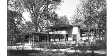
Although a genius at design, Frank Lloyd Wright was not known for caring too much about the engineering side of his projects. We undertook an overhaul of a Wright home that included all of the things you can't see but still matter.
Pop the Top
North Shore Frank Lloyd Wright
North Shore Frank Lloyd Wright

This newly constructed 3600 square foot house is on one of the best streets in Oak Park, this home blends seamlessly with its neighbors—Frank Lloyd Wright is right next door!—but the interior is designed for today’s lifestyle.
River Forest Facelift
North Shore Frank Lloyd Wright

A young couple expecting their second child purchased a beautiful old frame house in River Forest. The previous owner had added a large addition on the back—a great open space—which they had used for dining and a family room.
Modern Industrial Basement

Like many Oak Park and River Forest homes, this classic home didn't really have a family room. With two teens in the house, this homeowner decided to renovate her basement from a dank storage area to a lively friendly space.
The Charles Castle House
Two Flat Conversion to Single Family

With historic homes, our first priority is to acknowledge the work that has gone before us —this 1924 beauty had incredible original detail including exterior limestone, mahogany interior trims, hand painted gold leaf ceiling mural, four unique fireplaces and large flowing rooms.
Two Flat Conversion to Single Family
Two Flat Conversion to Single Family

Anyone who has lived in Chicago for any period of time has been inside a two flat. Like a bungalow, they are typically built with a single interior supporting wall down the middle making for a bit of a “bowling alley” effect–one long hallway down the middle with bedrooms on one side and public space on the other.
Kitchen Tudor Style

To provide a more open and airy feeling, many homeowners are eliminating or reducing upper cabinetry in their kitchens. In this home, the owner wanted no upper cabinets but also an older, more historical feeling to the kitchen, to match the Tudor exterior and heavy wood trims inside the house.
Gold Cost Chic

After moving into this Gold Coast condo, the homeowners knew they had to re-do the kitchen--which was very 90s with dark cherry cabinets and a dark granite countertop.
Historic Preservation Award
Historic Preservation Award

What to do with a strange second floor deck that is falling off your house? Make it into a perfect and serene ensuite bath!
Functional and Fun Basement
Functional and Fun Basement
Historic Preservation Award
Many families took advantage of this underutilized space over the last few years, adding bathrooms, insulation, wet bars, dry bars, play areas and bedrooms.
90s Time Machine
Functional and Fun Basement
Old Space New Use
Although this bathroom was the height of sophistication in 1990, the beige color scheme, tiny tiles, small, elevated tub and dark shower were past their prime.
Old Space New Use
Functional and Fun Basement
Old Space New Use
These two recent projects are great examples of how re-thinking your existing space can lead to a better home.
We love our customers! Email us and let us know how we can help.
